A guide to troublesome UI components
Table of Contents
A common opinion is that accessibility is expensive, and that if you think accessibility is expensive, you can deal with it later.
Here’s the twist: it will be expensive if you deal with it later. However, accessibility is not expensive if you discuss it as a team early in the process.
It is possible to build just about anything, it comes down to time and money. But no client ever has said, “Hey, we have a lot of time and money!” Accessibility is not expensive if you proactively plan for it. That’s why you need to learn how to avoid some of the common pitfalls.
Before we start
User interface (UI) elements are the parts we use to build apps or websites, such as links, accordions and checkboxes etc.
Some UI components are more complicated than other components. And some components are really complicated. All roles that build for the web (product owners, UX designers, art directors, developers, QA engineers) must know this.
The challenges
The components in this article all have the following challenges in common:
- Keyboard interaction. Everything that can be done with a mouse, must be possible to do with a keyboard. This includes navigating, opening and closing items, activating, stopping, starting, selecting, etc.
- Focus appearance and management. Users navigating by keyboard must know where they are. Always show the user’s current position in the interface. The focus order should be logical and intuitive.
- Consistent announcements. All events and interactions should correspond as understandable and relevant audio feedback in screen readers. Buttons should describe themselves as buttons, links as links, etc.
- Code quality. Using the correct elements and ARIA attributes, as well as valid HTML.
The components
Following are some UI components that have non-trivial considerations to use in an accessible way:
Custom selects
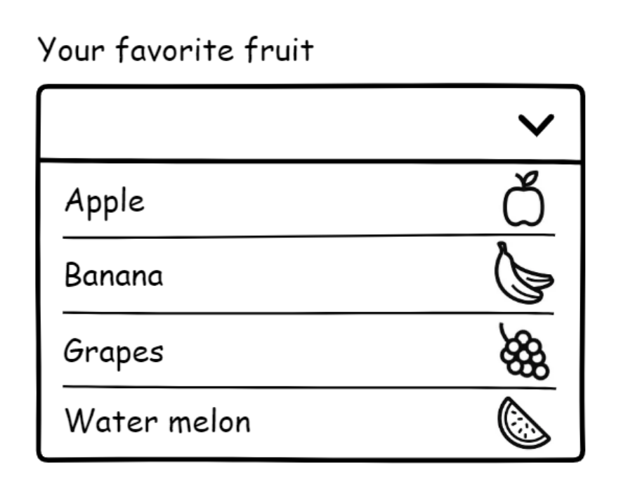
Native HTML <select> elements (sometimes referred to as dropdowns, not to be confused with disclosures) has the most understandable and usable experience across every platform compared to its custom-coded counterparts.
But here’s the thing: very often the design contains styling that will not work in a native HTML select element. Images of fruit (like in the illustration) cannot be added with HTML alone, we’ll need some trickery.
What can you style in a native HTML select?
- Closed state (the
<select>): Quite a lot. - Opened state (the
<select>'s<option>s): Not much. Probably not the way you want to style it. No padding, no borders, no custom layout, no images of fruit.
The lack of styling support in the native HTML select is the number one reason why some developers will start building something that is completely custom.
Advice for a custom select
Don’t build a custom select. There is so much JavaScript you must write just to make it behave like a native HTML select.
Talk to the design team and see if you can change the design. If not, use a native HTML <select>. It will save you so much time, both in terms of building it and fixing bugs.
Please note: the options in a native select will have a slightly different look depending which browser and device you’re on. This is actually a positive, because the UI is looking consistent to the browser and OS.
Further reading
- Initial thoughts on standardizing form controls
- Select your poison part 2 - 24 Accessibility
- How To Test A Select Dropdown - MagentaA11y
Modals
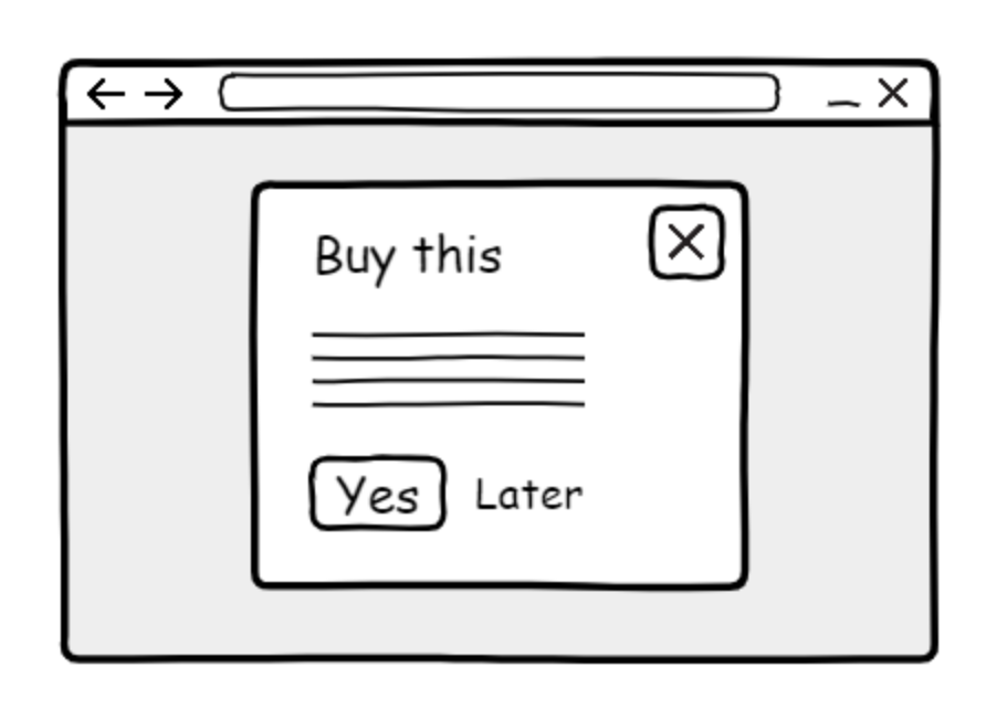
A modal is the kind of UI that is layered on top over the page content. A common visual treatment for modals is a box in the middle of the viewport.
This is a pattern where the user is being interrupted in their workflow. A modal can help you focus your attention on a single task, in circumstances where complicated or data-heavy interactions are present. Here, the modal breaks you out of your flow state, which could be helpful when communicating critical information.
However, interrupting people for non-critical things like, “Signup for our newsletter” or, “Check out these new products” can be annoying. When this kind of modal is presented, the users have to expend extra effort—interacting with the dialog to dismiss it.
Modals are also referred to as “dialogs”. Is there a native HTML dialog element? Yes, there is <dialog>. Is it perfect? Not yet.
Historically, the developers had to write tons of Javascript to create modals. Support for the <dialog> element is improving. But you still have to write JavaScript. Make sure you test your <dialog> code with assistive technology before deploying it for general use.
Advice for modals
A dialog can be accessible, but be cautious. Be aware of the most common flaws:
- The opened/closed state of the modal isn’t communicated to screen readers.
- Not possible to close the modal with the Esc key on a keyboard when it is in its open state.
- A modal's close button does not have accessible name that makes sense, such as using the letter “X” instead of the word “close”.
- Missing keyboard focus trap, meaning you can use the keyboard to navigate the content behind the modal while it is in an open state.
- Keyboard focus is not restored to the control that triggered the modal to open after the modal is closed.
Do consider if you can use alternatives to modals.
Further reading
- Modal & Nonmodal Dialogs: When (& When Not) to Use Them - Nielsen Norman Group
- Creating An Accessible Dialog From Scratch - Smashing Magazine
- Dialog (Simple Dialog) - Deque
- Modal Dialog Example - WAI-ARIA Authoring Practices 1.2
- Dialog (Modal) | APG | WAI | W3C
Autosuggest
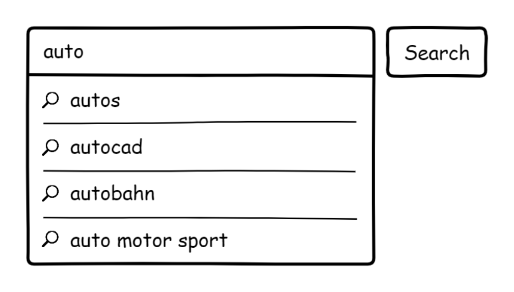
People will say “autocomplete” but generally mean autosuggest.
Autocomplete comes out of the box with HTML. It will make suggestions based on values the user has previously entered and submitted in similar form fields, like names and email addresses. Very useful. Do use it, follow this excellent autocomplete guide from MDN.
Autosuggest, however, is different. It looks like an autocomplete by displaying a list of suggestions as the user types. But the suggestions are compiled from a data source, not the user’s previous entries.
The data source can be a known and static scope like countries and cities, or a wide and dynamic scope like saved overall website searches.
Is there a native HTML element? There is a datalist element, but it is not very well supported:
- Datalist element | Can I use... Support tables for HTML5, CSS3, etc.
- Datalist_element (html) | Accessibility Support
Advice for autosuggests
Be assured creating a custom autosuggest is a real undertaking, especially since you have an as-you-type situation on your hands. Again, there is so much JavaScript to write to make it work in a robust and predictable way.
The autosuggest UI is good for exploring, spelling and speed. But very few autosuggests are accessible. Their most common flaws are:
- Navigation by keyboard is not coherent with established patterns.
- Focus order is not logical and intuitive, especially entering the list.
- No feedback to the screen reader what is going on.
I have seen how people struggle with this kind of UI. They failed to select the suggestion or thought the list of suggestions was the actual search result and didn’t press the search button.
There are a lot of details to get right for autosuggest experiences. User testing will reveal if it’s actually understood the way you intended.
Make sure that your model for building the suggestions themselves is rock-solid. If the suggestions are bad and not relevant—like showing suggestions for items you don’t have—it will hurt the search experience.
An easy-to-build and accessible alternative could be adding a list of popular links alongside the search input. If you save and tally user-enter searches in a database and use that for inspiration when compiling the list it can be helpful, even if it’s not dynamic or as-you-type.
Further reading
- Site Search Suggestions - NN Group
- 9 UX Best Practice Design Patterns for Autocomplete Suggestions (Only 19% Get - Everything Right) - Baymard
- Combobox WAI-ARIA Authoring Practices - W3C
Date pickers
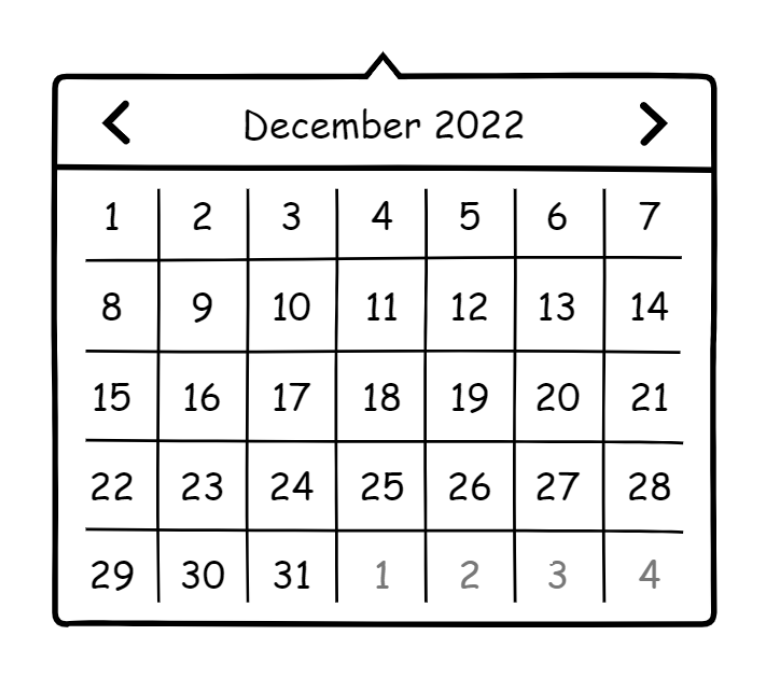
A date picker is a form field widget which pops up a small calendar.
Is there a native HTML date input element? Yes. Is it perfectly accessible with full browser support? Far from it.
There are many known issues in the different browsers:
- Is input type="date" ready for use in accessible websites? - Hassell Inclusion
- input(type-date)_element (html) | Accessibility Support
Should you then perhaps build a custom date picker? You know the answer to this one: no.
Advice for date pickers
There are many ways to input dates. A simple, effective way could be text inputs with date range validation, possibly combined with <select>s.
Sometimes, a date picker is actually the wrong UI to choose. Let’s say someone should input their date of birth. They would have to go backwards year by year, or even worse, month by month. That’s a lot of unnecessary interaction. If you think this is annoying, imagine how it is for someone with a motor control disability.
If you do decide to use a date picker, make sure the user can also input the date in ways other than the widget.
Further reading
- Safari's date-picker is the cause of 1/3 of our customer support issues
- Frustrating Design Patterns That Need Fixing: Birthday Picker — Smashing Magazine
- Maybe You Don’t Need a Date Picker — Adrian Roselli
Carousels
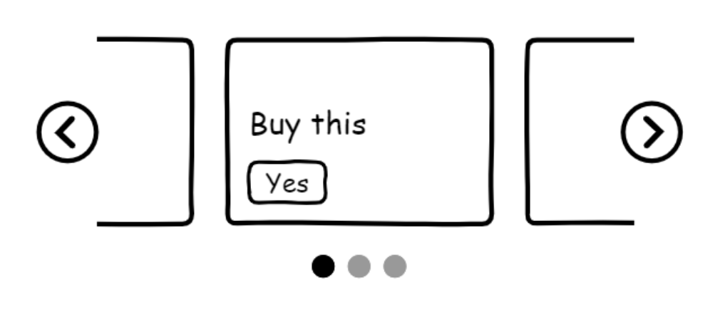
A carousel (also known as a slider) is the concept of having content (images, headings, links, etc.) in a horizontal scroll. Usually there are some arrow buttons that will rotate the carousel content through. Some carousels rotate by autoplay, which is extremely distracting.
Is there a native HTML <carousel> element we can use? No.
Advice for carousels
Do not build a carousel.
As an accessibility auditor, I have yet to see a carousel that didn’t have multiple critical accessibility issues. Common issues include:
- Cannot be operated with a keyboard.
- Missing visible focus indicators.
- Focus order is not logical and intuitive.
- Arrow buttons do not have accessible names.
- No feedback to screen readers.
- No possibility to turn off autoplay.
Besides the technical challenges, you should also be aware that the conversion rate for carousels is low. Very few users actually read or engage with these things.
Stakeholders, designers or product owners may really press you to use a carousel, because they let everyone get their content onto a page. When reaching for a carousel, ask yourself: What are you really trying to accomplish, and is this the right component to accomplish that goal?
If you find yourself in a situation where you’re forced to build a carousel, make sure the issues outlined earlier are addressed, bare-minimum.
Further reading
- Should I Use A Carousel?
- The Unbearable Inaccessibility of Slideshows
- More Alternatives To Using Carousels
Dynamically-loaded content

Dynamically-loaded content is when you have more content inserted without requiring a page load. JavaScript code will send a request to a server, get some data, and that data will get injected into the page as new content without triggering a page load event.
Some typical scenarios are loading more search results, filtering search results, and giving confirmation after submitting a form.
This kind of UI is very common. Also very common is:
- No feedback for screen readers that there is new content on the page.
- Page focus order becoming illogical and unintuitive.
Advice for dynamically-loaded content
Dynamic content is not impossible to implement accessibility-wise. It just requires some extra work—same challenges here as the previous UI considerations.
An example: loading more search results. When activating a “Load more” button, additional search results will be fetched and inserted into the page.
The visual focus for these results should be placed on the first link in the new content. This will help someone using a screen reader understand new content is present.
Also, dynamically loaded content is missing out on features like a shareable URL and finding content via Cmd/Ctrl + F.
For better assistive technology support, URL sharing, ease of maintenance, and other concerns: consider regular page loading and pagination UI instead.
A note on npm packages
A npm package is someone else’s code you can use for free. Developers install npm packages to save time.
The npm registry contains packages for all of these previously mentioned components. Several packages claim to be accessible or WCAG compliant. But that’s just the author’s own opinion. Don’t take their word for it. Test and evaluate properly before committing.
The problem with importing third party code is you have limited to no control. Even if you know how to fix the problem, you can’t. The issues are embedded in the package, but you are still responsible. It is your decision to allow and use this package in the first place.
In order to correct a problem you’ve found, you'll have to:
- Raise it with the package author,
- Hope it gets dealt with,
- If it does, then update the package, and then
- Review every instance of the component to ensure the fix is working.
Quite a slow and agonizing process.
At the end of the day, people don’t care how stuff was built. Can they use the UI or not? That's all that matters.
Closing thoughts
Is accessibility expensive and difficult? If you have no experience or knowledge, it might seem that way.
Accessibility starts with giving a damn. Ask questions in forums, join communities, and listen to webinars.
Have accessibility top of mind. Discuss as a team before you start building. As a member of the team, speak up when you see a problem. Just ask, “Is this going to be accessible?” It’s really that simple.