Everyday Accessibility
Table of Contents
Even with the best of intentions, you may be making decisions that exclude disabled users. Below are practical, intentional steps you can start today to create and share more accessible social media, digital, and multimedia content.
Watch this post as a video
Social Media Posts
Social media is central to the world's conversations, so ensure you're not leaving anyone out.
Use capital letters in hashtags
Punctuation helps text-to-speech tools like screen readers speak more accurately, and helps with readability overall. This includes in hashtags, where capital letters help distinguish words.
Key Point: Make it a habit to #UseCapitalLetters rather than #hardtoreadlowercase.
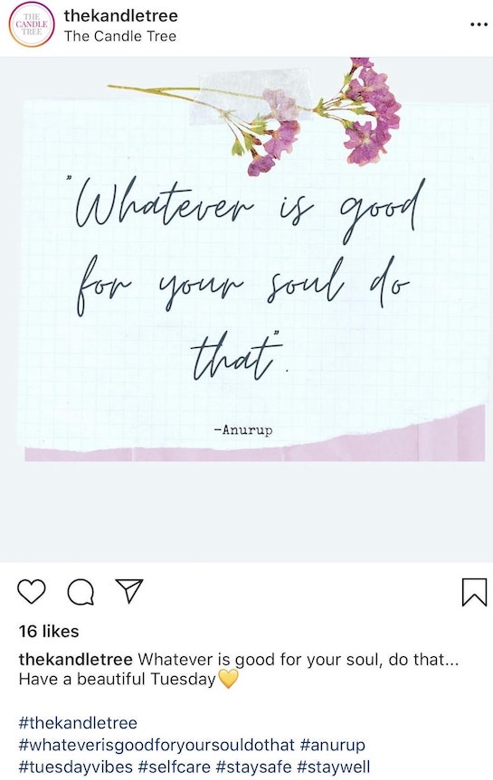
Don’t share just images of text
Images of text (such as your favorite quote or saying) can be difficult for people with visual impairments to read and don’t allow people with reading difficulties to leverage text-to-speech read-aloud features. When posting these kinds of images, also write out the text in your post.
Use “alt text” features to describe images
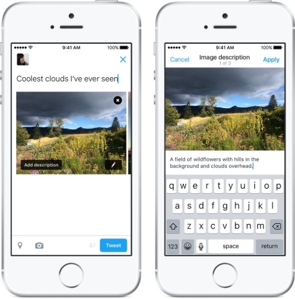
Pictures are significant in social media, but also inaccessible to visually impaired readers unless they have a text-based description. When uploading, find the “image description” or “alternative/alt text” feature in the software to write a description. For sample instructions, review Alt Text for Social Media.
When adding descriptions, don’t write every detail, just enough to ensure everyone can understand your post and share in the image’s meaning. For examples, read Scott Vinkle’s Considerations when writing alt text.
Limit your emojis
Emojis are great for emphasis and playfulness, but adding too many sounds cluttered with text-to-speech software. Also, when placed unconventionally (such as throughout a sentence) this is distracting and hard to read for those with reading difficulties. Keep your emojis to the minimum needed to make your point, group them together, and move them towards the end of any text.
Key Point:
Avoid writing: I 👏 know 👏 that’s 👏 right 👏!!!
Because text-to-speech reads: I [clapping hands] know [clapping hands] that’s [clapping hands] right [clapping hands] !!!
Documents
Accessibility is not just for the Web, but all of our digital content.
Use a program’s built-in styling features
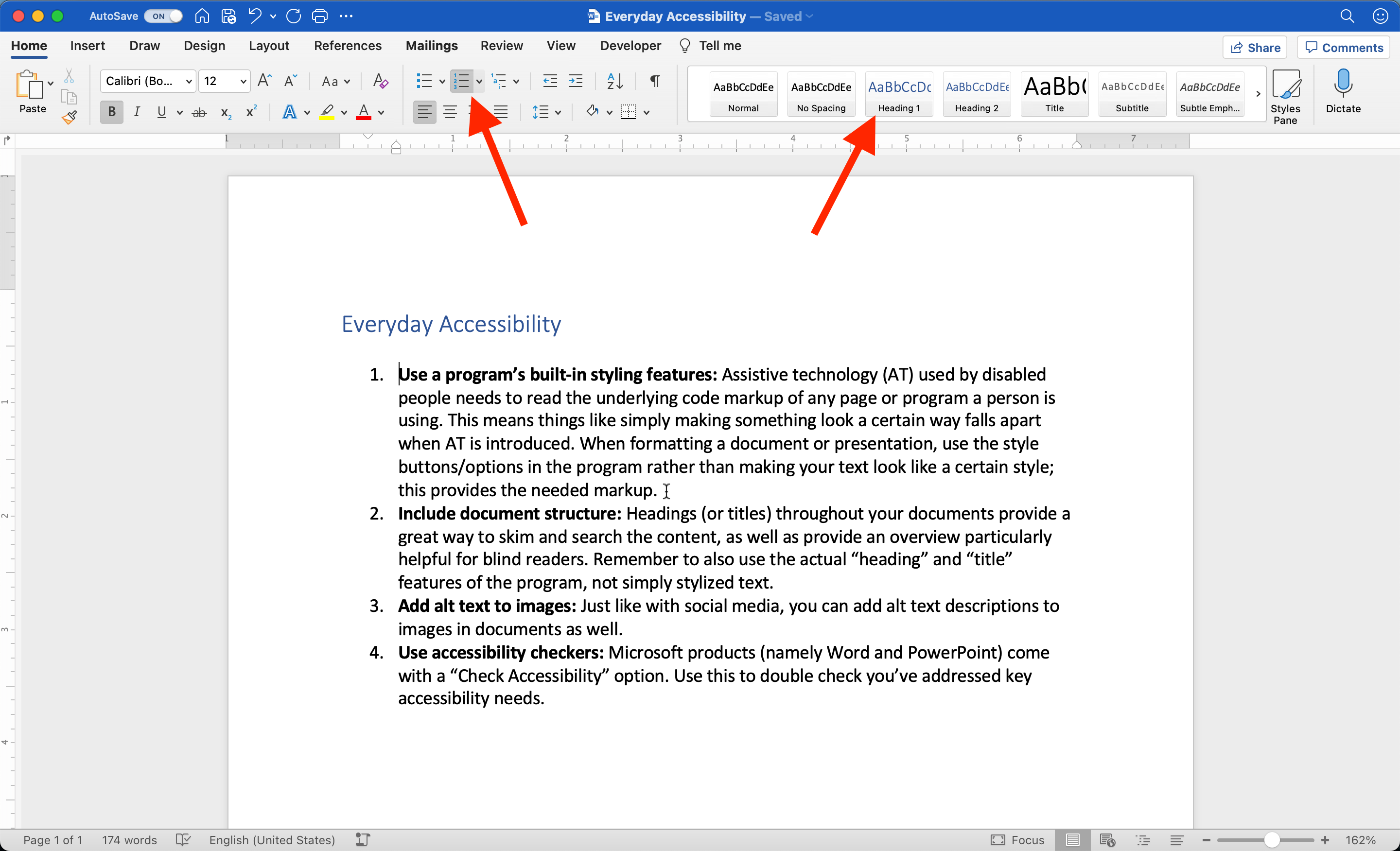
Assistive technology (AT) doesn't interpret a page or document like people do with their eyes. AT is reading the underlying code markup, which means simply making something look a certain way is not sufficient. When formatting a document or presentation, use the style buttons/options in the program to provide the needed markup; for instance, use the “bulleted list” button rather than just a dash (-) to format a list.
Include document structure
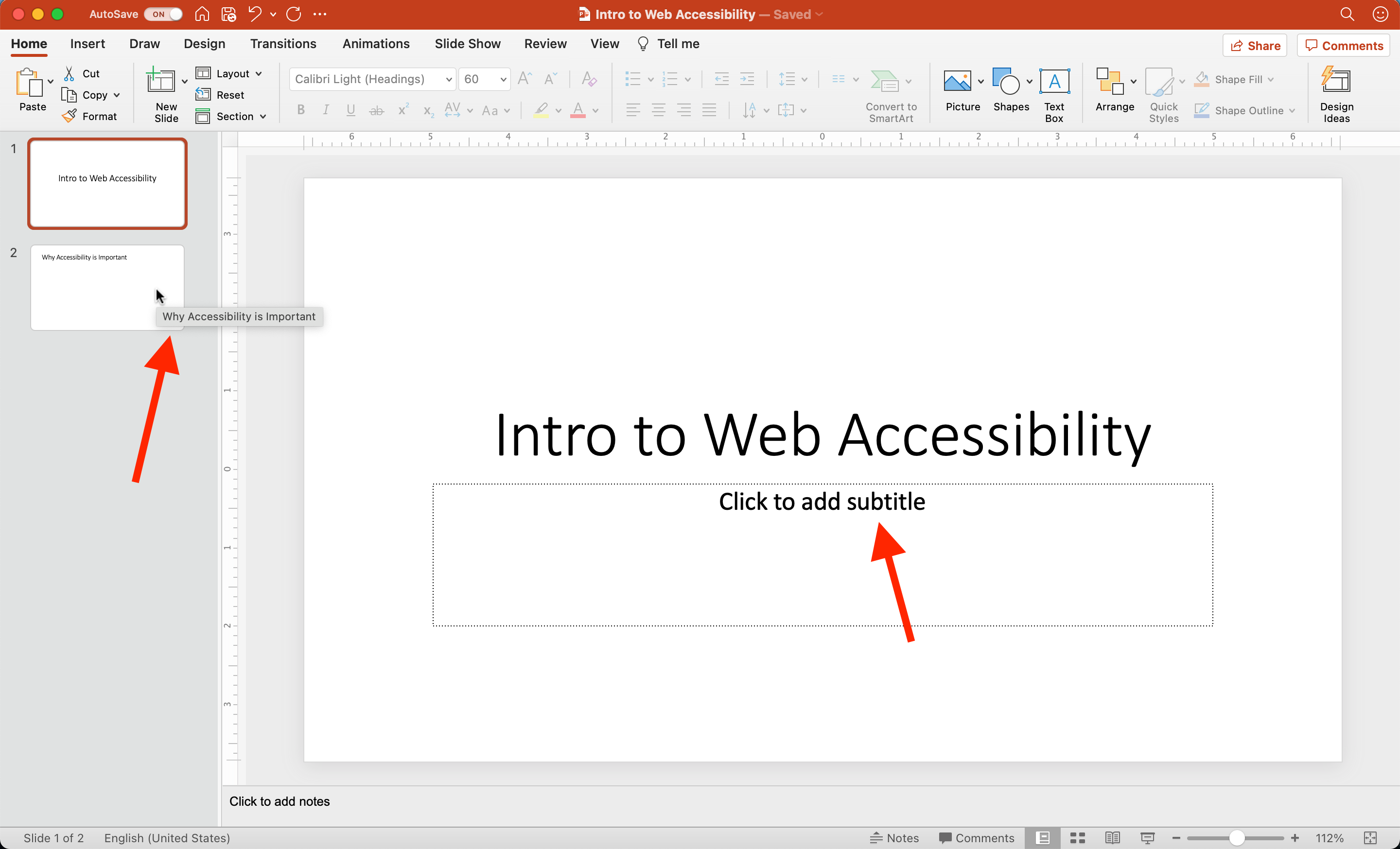
Headings (or titles on slides) provide a great way for everyone to preview, skim, and search content. Structure is particularly helpful for blind readers who want to get an overview of the document before reading line-by-line. Include headings throughout a document and titles on every slide, and remember to use the actual “Heading” and “Title” features of the program, not simply stylized text.
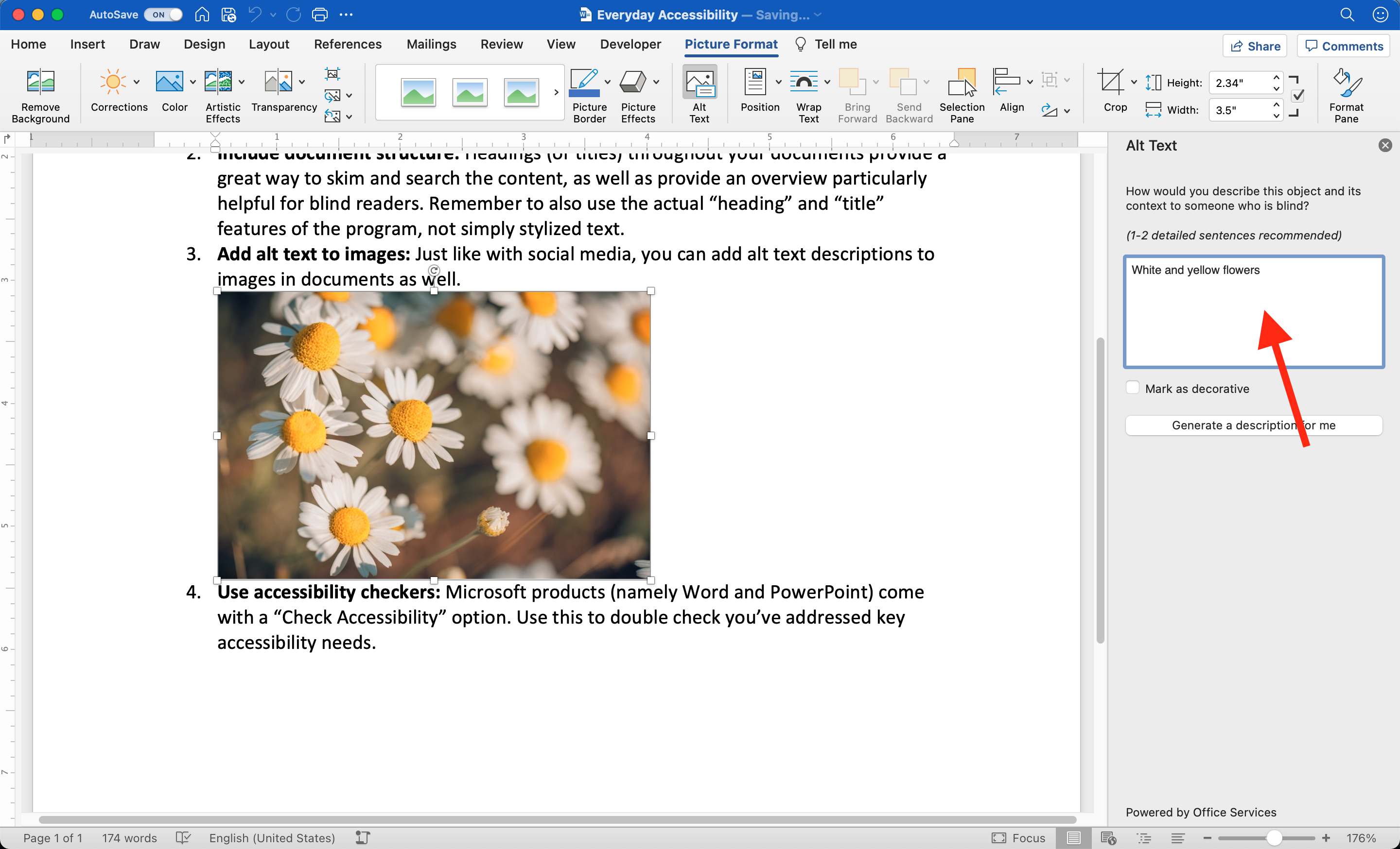
Add alt text to images
Just like with social media, you can add alt text descriptions to images in documents as well. You will typically see an input box to add descriptions grouped with other options when you insert the image.
Use accessibility checkers
Microsoft products (namely Word and PowerPoint) come with a “Check Accessibility” option. Use this to double-check you’ve addressed key accessibility needs.
![The Check Accessibility menu option is activated on a simple PowerPoint deck where one slide is missing a title. The Accessibility pane shows the 'Missing slide title' error and the mouse hover text for that slide also reads '[No Title]'.](/img/posts/everyday-accessibility/PPT_A11yChecker.png)
Audio and Video Content
We can all create multimedia, but let's ensure we don't ignore the best practices.
Have clear audio
Though all of our devices can record audio and video on-demand, sound quality can vary making it difficult for some to hear the content. Be sure to speak as clearly as possible, preferably at a steady pace and reasonable volume, and remove or avoid background noise including echo, empty room effect, humming, or white noise.
Key Point: Using a microphone (even a common corded headset) can help amplify voices and minimize distracting unwanted sounds.
Reduce background music
Instrumental music can enhance content’s quality, but not when it reduces the ability to hear the main speaker. When using background music, keep it to a minimum (such as during an intro) or, if used throughout, ensure it is very low.
Key Point: Consider putting your background music at the volume of a whisper.
Provide text with multimedia
As with images, video and audio can be engaging but also inaccessible without a text equivalent for people who are deaf-blind, having sensory processing disorders, or have hearing impairments. Having media content written out as text is vital for inclusiveness. Text equivalents can include transcripts that type out spoken dialogue, or an article that accompanies a video (as in a video that supplements a news article).
Key Point: Where there’s media, make sure there’s also text.
Avoid flashing content
Content that flashes on the screen more than 3 times per second is dangerous as it can trigger a seizure in some viewers. Use rapid movement sparingly in your videos and ensure nothing flashes. You can use the Trace Center’s Photosensitive Epilepsy Analysis Tool (PEAT) to identify seizure risks in web content and software.
Key Point: Creating content comes with a responsibility to create safe content.
Advocate for Accessibility
We have to work collectively to make inclusion happen.
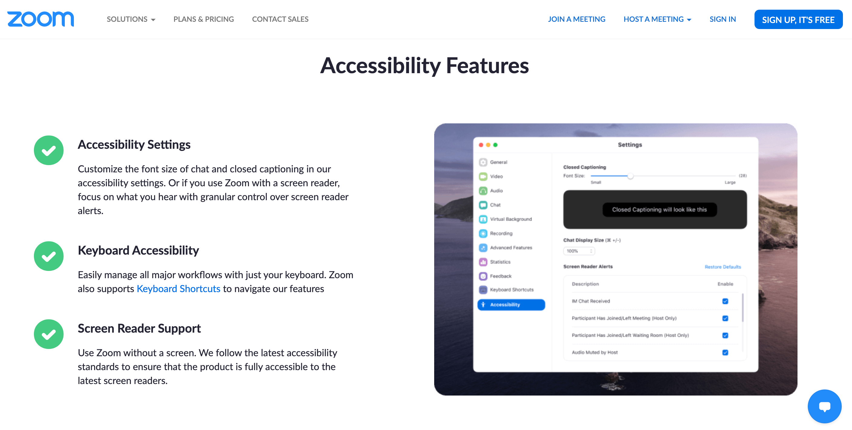
Seek accessibility features
Actively search for “accessibility” in the tools you use every day — from survey creation sites to website design platforms. Understand what you can do to make sure your output is inclusive.
Ask about accessibility
If a system doesn’t offer accessibility features (which is unfortunately very common), reach out to the company about their accessibility policy and roadmaps via the customer support channels. Also, ask about it internally where you work and attend school. Don’t leave this to just your disabled colleagues to take on.
Key Point: Customer pressure can help move accessibility to the front of a company’s roadmap.
Seek to learn more
There’s a lot more to learn and the more allies who know about accessible and inclusive digital practices, the more we can make a big difference for who can participate in our ever-growing digital spaces.
Key Point: You can start your learning journey with The A11Y Project’s Resources Page.