Create accessible forms
Table of Contents
With the world becoming data reliant, it's no surprise how data is the new gold. With the right data, you can improve peoples' lives, find solutions to problems and so on. There are many ways to capture peoples' data but on the web, forms are your go-to solution.
Here are some practical tips on how to write accessible forms.
Always label your form inputs
Labels are a great way to get started with writing accessible forms. They are vital for helping people who use screen readers and other kinds of assistive technology determine what label text go with what input field.
To associate a <label> with an <input>, set the identifier(ID) in the <input> to correspond with the for attribute of the <label>. This is the generally accepted approach.
<form>
  <label for="firstName">First Name</label>
  <input type="text" id="firstName" name="firstName"/>
</form>
Note: Do not to nest <input> inside of <label> because some assistive technology (such as Dragon NaturallySpeaking) do not support it.
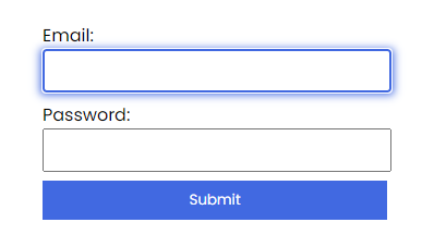
Highlight input element on focus
Form insertion carets can be difficult to track. A simple solution is to highlight <input> on focus. This way, people do not have to guess where they are on the form.

input:focus {
  outline: 2px solid royalblue;
  box-shadow: 1px 1px 8px 1px royalblue;
}
Break long forms into smaller sections
Filling long forms can be stressful. This is largely true for almost everyone but particularity for people with AD/HD. Such forms can lead to an increase in Bounce rate which isn't what anyone wants. A simple solution is to break them into smaller sections. This helps make long forms less daunting and easier to understand as it is provided in bits.
The following principles apply for multi-step forms:
- Repeat overall instruction on every page.
- The forms should be split into logical groups.
- The forms should inform the person about the progress thay are making.
Note: There are no hard rules that defines a long form. However, you should consider if the form can be broken down into different logical sections.
Provide error messages
When people encounter errors, they may need help to determine what's wrong and why. A common way forms indicate invalid fields is to change the <input> border color to red which is not ideal. The reason for this is because a change in color alone is not exposed to assistive technologies, so indicating errors in such ways will not inform the person of the error. Also, relying on color alone may also not work for someone who is red/green colorblind.
The following are ways to effectively and accessibly communicate form errors:
- Let the person know there is an error.
- Let the person access the error, and provide instructions on how to fix it.
- Allow the person re-submit the form.
In the code below, there is an empty live region which report errors to assistive technologies. Additionally, each field is followed by a hint which is hidden by default but shown if that field does not validate.
<form>
  <label for="username">Enter a username</label>
  <input type="text" id="username">
  <p class="hint hidden" id="usernameHint" >Your username cannot contain punctuation</p>

  <label for="email">Enter your email address</label>
  <input type="text" id="email">
  <p class="hint hidden" id="emailHint">Please enter a valid email address</p>

  <label for="password">Enter a password</label>
  <input type="password" id="password">
  <p class="hint hidden" id="passwordHint">Your password must be at least 6 characters</p>

  <div aria-live="assertive" id="message"></div>

  <button type="submit">Submit</button>
</form>
.hidden {
display: none
}
.hint {
color: red;
}If validation errors occur, two things happen:
- The live region is populated upon form submission, announcing to assistive devices that there are errors.
- Each invalid
<input>is given anaria-invalid="true"attribute and connected to a hint using anaria-describedbyattribute.
Here's the markup for the email field in its invalid state:
<label for="email">Your email</label>
<input type="text" id="email" aria-invalid="true" aria-describedby="emailHint">
<p class="hint" id="emailHint">Invalid email address.</p>
Avoid horizontal form layout unless necessary
Layout attributes a great deal to the usability of a site. With CSS, changing a form's visual layout is possible. However, changing the visual layout create problems for people who rely on the structural layout of the page. Because of this, your forms should have a meaningful and logical sequence. If possible, avoid making your form inputs next to each other. This is because people have to spend a little more time correlating the labels with their elements, resulting in slower form completion.
Summary
Accessible forms are important because they help both individuals and businesses thrive by making sure they collect data from the widest possible audience. This, in the long run, leads to growth.
The following are tips on how to create accessible forms:
- Always label your inputs.
- Highlight input element on focus.
- Break long forms into smaller sections.
- Provide error messages.
- Avoid horizontal layout forms unless necessary.
Further reading
- User Notifications WAI Web Accessibility Tutorials 2014
- Provide helpful error messages Harvard university 2014
- HTML label element reference MDN web docs 2020
- Don’t Use The Placeholder Attribute Smashing Magazine 2018
- HTML5 Accessibility Chops: the placeholder attribute TPGi 2011
- Using @placeholder on Input W3C 2012